10 Tips for Good Graphic Design
10 Tips for Good Graphic Design
Boost your graphic design skills to create stunning visuals. Learn tips on color formats, resolution, detail, simplicity, vectors, quality, originality, and primary colors for impactful designs.
10 Tips for Good Graphic Design
Good graphic design is essential in creating visually appealing and effective designs. Whether you are a professional designer or a novice, following these 10 tips will help you improve your graphic design skills and create stunning visuals that leave a lasting impression.
Check Your Colour Format!
One of the most important aspects of graphic design is color. Choosing the right color format is crucial to ensure consistent and accurate colors across different devices and platforms. Always work in the CMYK color mode for print designs, as it offers better color representation. For web and digital designs, use RGB color mode. Remember to always double-check your color settings before starting any project.
When it comes to graphic design, color plays a significant role in conveying messages, evoking emotions, and creating visually appealing compositions. The right color format can make or break a design, as it directly affects how colors are displayed on various mediums.
Let's delve deeper into the two primary color formats used in graphic design: CMYK and RGB. Understanding the differences between these formats will help you make informed decisions when working on different projects.
CMYK, which stands for Cyan, Magenta, Yellow, and Key (Black), is the color model used in printing. It is a subtractive color model, meaning that colors are created by subtracting light from white. In CMYK, the more ink is added, the darker the color becomes. This color mode is ideal for print designs, such as brochures, business cards, and magazines, as it offers a wider color gamut and better color representation on paper.
On the other hand, RGB, which stands for Red, Green, and Blue, is the color model used for digital displays, such as computer screens, mobile devices, and websites. It is an additive color model, meaning that colors are created by adding light together. In RGB, the more light is added, the brighter the color becomes. This color mode is suitable for web and digital designs, as it accurately represents colors on electronic devices.
It is crucial to use the appropriate color format for each medium to ensure consistent and accurate color reproduction. Using the wrong color mode can result in colors appearing differently than intended, leading to a lackluster design or miscommunication of your message.
Before starting any project, it is essential to double-check your color settings. Ensure that you are working in the correct color mode based on the intended medium. This simple step can save you time, effort, and frustration in the long run.
Additionally, keep in mind that different devices and platforms may have variations in color rendering. What looks vibrant and vivid on your computer screen may appear dull or washed out on a mobile device. To mitigate this, consider calibrating your devices and testing your designs on multiple platforms to ensure consistent color representation.
Remember, color is a powerful tool in graphic design, and understanding how to use the right color format is essential. By working in the appropriate color mode and double-checking your settings, you can create designs that captivate and communicate effectively across various mediums.
What’s Your Resolution?
Before diving into designing, determine the resolution of your project. For print designs, use a DPI (dots per inch) of at least 300 to ensure high-quality output. When creating web graphics, consider the screen resolution of your target audience. Designing with the correct resolution ensures crisp and clear visuals.
Resolution plays a crucial role in the quality and clarity of any design. It determines the level of detail and sharpness that can be achieved in both print and digital mediums. When it comes to print designs, such as brochures, flyers, or posters, using a higher DPI (dots per inch) is essential to ensure that the final output is of high quality.
Why is DPI important in print designs? Well, the higher the DPI, the more dots per inch are used to create the image. This means that there are more individual dots, or pixels, to represent the details and colors of the design. As a result, the final print will have a greater level of detail and sharpness, making it visually appealing to the viewer.
On the other hand, when designing for the web, considering the screen resolution of your target audience is crucial. Screen resolution refers to the number of pixels displayed on a screen, usually measured as width x height. Different devices have different screen resolutions, ranging from standard definition (SD) to high definition (HD) and even 4K displays.
Designing with the correct screen resolution in mind ensures that your web graphics appear crisp and clear on various devices. If you create graphics with a low resolution, they may appear pixelated or blurry on high-resolution screens. Conversely, if you design with a high resolution, the file sizes may become larger, affecting the loading speed of your web pages.
It's important to strike a balance between resolution and file size when designing for the web. Optimizing your graphics for the target screen resolutions of your audience will enhance the overall user experience and make your website visually appealing.
Additionally, keep in mind that different devices and browsers may render web graphics differently. It's a good practice to test your designs on multiple devices and browsers to ensure consistency and compatibility across various platforms.
In conclusion, determining the resolution of your project is a crucial step in the design process. Whether it's for print or web, understanding the impact of resolution on the final output is essential for achieving high-quality visuals. So, before you start designing, take the time to consider the DPI for print designs and the screen resolution for web graphics. By doing so, you'll ensure that your designs are crisp, clear, and visually appealing to your target audience.
Pay Attention To The Details
Great design lies in the details. Paying attention to every element of your design is crucial in creating a visually stunning and cohesive piece. From typography to spacing and alignment, each aspect contributes to the overall aesthetic appeal.
Typography plays a vital role in design. Choosing the right typeface can convey the intended message and evoke specific emotions. However, it's not just about selecting a font; it's about understanding the nuances of typography. Details like leading, which refers to the space between lines of text, can greatly affect readability and visual flow. Ensuring the appropriate leading is set can make a significant difference in how your design is perceived.
Kerning, on the other hand, refers to the adjustment of space between individual characters. Proper kerning can enhance legibility and prevent awkward gaps or overlaps. It's important to meticulously adjust the spacing between letters to achieve a harmonious and balanced look.
Tracking, also known as letter-spacing, involves adjusting the overall space between a group of characters. This can be particularly useful when dealing with headlines or display text. By increasing or decreasing the tracking, you can create a more compact or spacious appearance, depending on the desired effect.
Spacing and alignment are equally important in design. Consistency is key - ensuring that all elements are aligned properly and follow a cohesive visual style creates a sense of professionalism and attention to detail. Paying close attention to the spacing between elements can help avoid clutter and create a visually pleasing composition.
Moreover, the use of white space, or negative space, is crucial in design. It allows the eye to rest and helps highlight important elements. Properly utilizing white space can create a sense of balance and elegance in your design.
When it comes to details, it's essential to consider the overall user experience. How will your design be perceived by the audience? Will it be easily navigable and intuitive? These questions should guide your decision-making process, ensuring that every detail contributes to a seamless and enjoyable user experience.
By paying attention to the details, you can elevate your design from good to exceptional. Remember, it's the small things that make a big difference in creating a visually stunning and impactful piece.
Simplify Yourself
Less is more in graphic design. Avoid cluttering your designs with too many elements or excessive text. Embrace negative space and let your design breathe. Simplicity not only makes your design visually appealing but also helps communicate the intended message effectively.
Kerning
Kerning refers to the adjustment of space between individual characters. Proper kerning can improve the legibility and visual balance of typography. Pay attention to kerning, especially in headlines and logos. Avoid awkward gaps or tight spacing between letters.
V is for Vector
If you want your designs to be scalable without losing quality, use vector graphics. Vector graphics are made up of mathematical equations and can be scaled to any size without pixelation. They are perfect for creating logos, illustrations, and other graphic elements that need to maintain sharpness and clarity.
Think Contrast
Contrast is a key design principle that draws attention and adds visual interest. Use contrasting colors, sizes, and shapes to create emphasis and hierarchy in your designs. Contrast can help guide the viewer's eyes and make your designs more engaging.
Quality Matters
Always strive for high-quality images and graphics in your designs. Use high-resolution images and avoid stretching or distorting them. Poor image quality can diminish the overall impact of your design and make it appear unprofessional. Remember to optimize images for web to ensure fast loading times without sacrificing quality.
Do Not Plagiarise
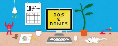
Originality is paramount in graphic design. Avoid plagiarism by creating your own unique designs and illustrations. Stealing or copying someone else's work not only undermines your skills but also violates copyright laws. Be creative, experiment, and let your imagination shine through your designs.
Primary Colours
When choosing colors for your design, consider using primary colors as a starting point. Primary colors, such as red, blue, and yellow, are versatile and can create a strong visual impact. They can also be easily combined to create secondary and tertiary colors. Experiment with different color combinations to find the perfect palette for your design.
In conclusion, good graphic design requires attention to detail, thoughtful use of color and contrast, and a commitment to originality. By following these 10 tips, you can elevate your design skills and create visually stunning graphics that captivate and communicate effectively.
Keep Reading


Hate Labels?
Love em or hate em, we make them work how you want them to. Whether you want your tags removed or new ones printed, we’ve got plenty of options to fit your needs.
Print on Demand
Hey I like that t-shirt, where can I get one? If this is happening to you a lot, we’re here to help. Kickstart your print on demand journey with our POD. Dropshipping is easy with The Print Bar.