Our Not Yr Sweetheart exhibition is right around the corner, and as opening night approaches (Saturday, August 1st) we at The Print Bar x The Push thought it’d be interesting to chat with some of our NYS artists about who they are, what their works will be like, and who they see themselves as!
Get to know 5/16 of our brazen Aussie art babes before Not Yr Sweetheart crashes into action!
Who the hell are ya, babe?
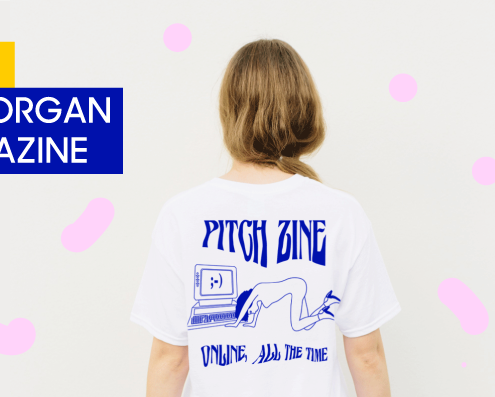
I’m a 20-something designer, editor + director! Originally from Brisbane, but I recently moved to Sydney. I run the independent online and print magazine PITCH, and freelance too.
What Pantone/Web/CMYK colour are you and why?
Without a doubt 7422 coated ’cause let’s be honest, pink is the new black.
3 artists who seriously influence your work?
Jennifer Mehigan
Amy Wang
Lindsay Hattrick
All these ladies make some damn good art.
100 words about your piece(s) for Not Yr Sweetheart?
It’s what y’all are thinking, but aren’t game enough to say. My piece is a stockpile of Tweet’s by the modern woman, in a digital zine format (check out the sneak peak above!)
One thing you can’t live without?
Soundcloud :’)
Where can we find you! (social media + web links)
Who the hell are ya, babe?
Hey there! My name is Ellie Anderson (also known as The Art of Ellie). I’m a Brisbane based illustrator and printmaker! My practice uses drawing and silkscreen printing to explore patterning and the natural environment. I resource my ideas and imagery from a cross-section of cultural influences, particularly from past travel experiences. My work is best known for its fusing of intricate patterns with flora and fauna, but for this exhibition I’m dabbling in more bold abstract pattern making, with fun.
What Pantone/Web/CMYK colour are you and why?
Pantone Blue 072C. The best words to describe this colour are Electric Blue. I love this colour because it’s both subdue and vibrant; it has an incredibly soothing effect while also being a pop colour!
3 Artists who seriously influence your work?
Miso (Stanislava Pinchuk) for her incredibly detailed works.
Spencer Harrison for his colour palette, and his fun naive style.
Laura Slaters because I love her layered, textural textile designs.
And Kelsey Brookes because his work is insane!
100 words about your piece(s) for Not Yr Sweetheart?
My works explore the relationship between identity, gender roles, and our increased social connectivity with the world. In this social media intrenched age, our identities are more fluid then ever; we can present a very different cyber ‘self’ to the world. With the power of online communication our genders roles and identities are easily manipulated, and this calculated presentation of self is a performance of who we are, or rather who we want to be. Through layered silkscreen prints of abstracted figures, shapes, and repeat patterns, my works explore this idea; our identities and gender roles are an act, performed and presented to how we wish to be perceived.
One thing you can’t live without?
My chickens… yes I am a crazy chicken lady, haha!
Where can we find you!
Who the hell are ya, babe?
My name is Sabrina Elliott and I am an artist hailing from the Pacific Northwest, specifically Portland, Oregon. I am both a painter and illustrator who sometimes dabbles in crafts like ceramics, polymer clay, and shrink plastic wrap. By day, I work in a rad comic book shop; by night, I play video games and work on zines, original illustrations/paintings, and commissions. I am anime trash and a Scorpio.
What Pantone/Web/CMYK colour are you and why?
Probably either Pantone Bubble Gum or Cotton Candy pink. I love pastel pink. I used to rebel against the color when I was younger but now I love it obsessively. That and sea foam green. There’s something about pastel ice cream colors that really get me. I think of either vibrant pastel blue and pink pre-sunsets or those vintage pink telephones, fridges, and cars. I just love that shade. I have a lot of rose quartz that are that color as well. There’s something warm and soothing about it. And it’s just super cute. I want anything that is that color. Maybe it’s the color of my soul.
3 artists who seriously influence your work?
I am seriously inspired by Hikari Shimoda, Ryan Heshka, and Hellen Jo. And a bonus: constantly amazed and impassioned by the work of Sam Bosma! These people rock my art world!
100 words about your piece(s) for Not Yr Sweetheart?
I have a hand printed lithograph piece and a few stickers and some ceramic brooch goodies. I find that I have a lot of playfully erotic themes in my work. My print, titled “Nice Pussy”, depicts a woman wearing a pair of panties with a cat face on it. It’s silly and tongue in cheek and makes you think of sexy stuff in maybe, like, a cute way. I’m drawn to beautiful eroticism and all the nuances of it. I don’t think sex has to be such a serious thing all the time. It’s important but people need to not be so wary or afraid of it. I think America is really obsessed with it yet still regards it as this really dirty thing (and not in a good way). One of my stickers is a little demon babe tied up in shibari knots with hairy legs. She has a submissive yet confident “come hither” look. I admire that kind of confidence. It’s wonderful. And so is body hair! I don’t really shave my legs and I randomly, on and off, shave my pit hair. It’s all great and people need to accept that it’s natural and just as attractive. I want people to look at this sticker and admire what she’s got going on. She’s a strong, confident, erotic succubus who isn’t afraid of what she wants and what she’s all about. I think that’s why people like it so much. She is unabashedly herself. Women are so powerful and so is our sexuality. We own it and you need to not be afraid of it (well, perhaps a little fear is healthy). Actually, fear us. Because we’ll kick your ass! Lastly, the other sticker I have is a naked woman who acts as the handle of a switchblade. We can be dangerous, so y’all better respect and treat us right.
One thing you can’t live without?
Chocolate! I’m such a chocolate fiend. I just ate a whole qtz of chocolate fudge brownie ice cream today. It’s too good. Help.
Where can we find you!
Under a tiny leaf. Also at the links below:
Who the hell are ya, babe?
I’m Rosie Turner from Newcastle, I live in a windy terrace house and I’m a ceramic artist and illustrator. I’m 26, I studied Fine Art and everyone thought I was studying “Finance” because I must have mumbled.
If we were dating I would probably take you for a night time picnic. We would eat cheese and drink wine from the bottle and the night would most likely end on the cliffs by the ocean with me peeing in the bushes and you keeping lookout. It’d be fun, really.
What Pantone/Web/CMYK colour are you and why?
Pantone 541C – it’s got an unpretentious sense of luxury. I’ve always has a sense of laying it on thick. I’m not minimal at all. But I appreciate balance between really rich sensations and something simple and wholesome. So in reality that means my last $10 is usually spent on flowers or champagne on special. What is rent even?
3 artists who seriously influence your work?
Reg Mombasa – Australian ugliness.
Ken Done – Australian optimisim.
Dolly Parton – Nothing to do with Australia but she’s just the business.
100 words about your piece(s) for Not Yr Sweetheart?
My works for NYS are about brutality and beauty I guess. I’m interested in bringing together a sense of Australian optimism and dread. I feel it when I think of the terror of landscape, its distance, loneliness and possible rejection of humanity I get a little buzz The Australian landscape holds so much opportunity for horror and that’s very thrilling.
I want to create things that are awful and delightful, I guess also it’s exactly how I see myself. ‘Dead Wallaby’ and ‘Tasmanian Devil Dream’ are illustrations of that, bright and airy but…fuck that mammal could tear my leg off. I think there’s something in being a creature that’s both terrible and magnificent.
One thing you can’t live without?
PASTA. I would have said my long term totally ace life partner but he’s not a “thing” and how good is gluten? C’mon.
Where can we find you!
Who the hell are ya, babe?
Mate, I’m an illustrator and designer currently living in Melbourne. I draw a lot, think a lot and consume a lot of visual media every day and that is pretty much my job in a nutshell. I don’t really do too much other than these things, but when I am it’s out in the sunshine, away from any monitors, lapping up some greenery or a sea breeze.
What Pantone/Web/CMYK colour are you and why?
How could I choose a favourite? I’m going to go with my current mood and say today I am at the top of the spectrum, Pantone Yellow 012 U; keeping basic, keeping it real, keeping it very vibrant and as Chris Johanson would say embodying the sunlight of the spirit. Optimism!
3 artists who seriously influence your work?
Seiichi Hayashi and Geoff McFetridge with their beautiful lines, Margaret Kilgallen for her unapologetic telling of women’s stories and the spirit that shines through in her work and words.
100 words about your piece(s) for Not Yr Sweetheart?
My piece is a self portrait, documenting some recent transitions and thoughts. The scene is at my bedroom window, sitting amongst my plants. I’ve spent a lot of time here lately working, procrastinating and thinking. Processing emotions, checking in with myself, trying to digest how I’m feeling is a laborious time for me. Everything is inside, existing within the mind. While a calm, collected exterior often gazes off into space some brutal analysis and tumultuous thinking is bubbling beneath the surface. After shifting perspectives and over-analysis, my tracks can finally change and I can create a new, positive, optimistic path for myself.
One thing you can’t live without?
Lately I can’t live without Always Fresh Baby Cornichons.
Where can we find you!
♥♥♥
Get all the goss on Not Yr Sweetheart’s opening night ~ Visit the event page.

