“I don’t know how to put this…but I am kind of a big deal.”
If you want to be chanting this, just like Ron Burgundy, whether that is at the next house party, friendly soccer match or ordering a dirty chai with almond milk at your local café, you’d best be sporting a well-conceived t-shirt to support your claim. And to ensure that your design is pixel perfect, there are a few things you need to know.
To every student, illustrator, graphic designer and budding custom t-shirt artist, this post was written for you! Brilliant graphic designer, Joel Matheson, takes us through his top 10 tips to transfer your digital design to pristine print!
1. Check Your Colour Format!
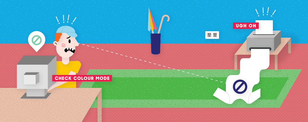
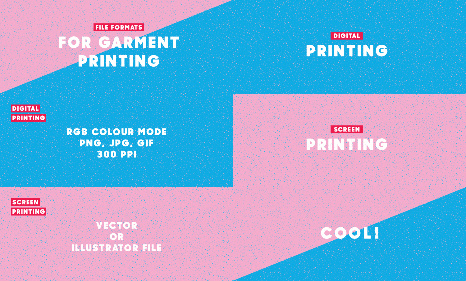
Although artwork colour modes for print are usually required in CMYK (Cyan Magneta Yellow Key), to digitally print on garments you’ll actually need to design in RGB (Red Green Blue) colour mode, so that you can export to .png format – the ideal file type we use to print garments with.
ALWAYS DO THIS BEFORE YOU START DESIGNING
| You can do this in Illustrator by navigating to: | File > Document Color Mode> RGB Color |
| You can do this in Photoshop, by selecting: | Image > Mode > RGB Color |
If you don’t design in RGB format you run the risk of having dull and distorted colours! Rather than a bright, beautiful turquoise printing from your original design, your print will instead be a gross…I mean, ‘nice’ murky, navy blue colour. Lel.
2. What’s Your Resolution?
If you don’t want to stress – check the RES. Always do a quality check before finalising and sending your artwork. For print, aim for at least 300dpi/ppi – 600dpi/ppi (dots per image/pixels per inch). You can check your image resolution by doing the following:
| Check resolution in Illustrator: | Effect > ‘Document Raster Effect Settings’ |
| Check resolution in Photoshop: | Image > Image Size > Resolution |
3. Pay ATTN to the Details!
We’re only human, we realise we’re not perfect, but it sure pays to pay attention to the finer details! One of the most common mistakes you can make is not cleaning up your artwork thoroughly. Leaving marks, as subtle as they may be, around the edges or border of your artwork, small parts in the background or even small lines of shading can mean the difference between a tee-rific, retail quality design, and a big old ‘D’OH!’ moment plus wasted shirts! Always double check, or even get a friend to help check with you!
4. Simplify Yo’self
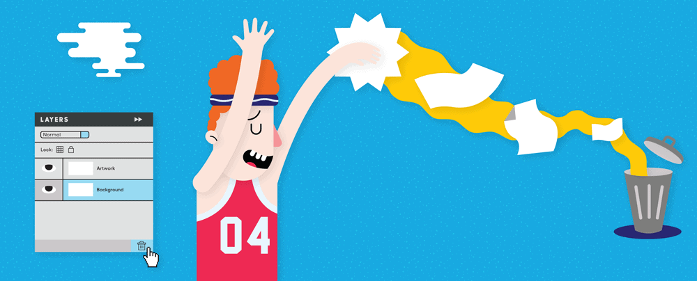
Kill any unwanted background layers. If you don’t you may run the risk of printing a big black box around your white logo – not very effective when printing onto a dark blue shirt! Remove the background layer’s very existence, shoot it, then dump it in the trash… or just delete the background layer/s. Whatever suits.
5. Learn to Kern
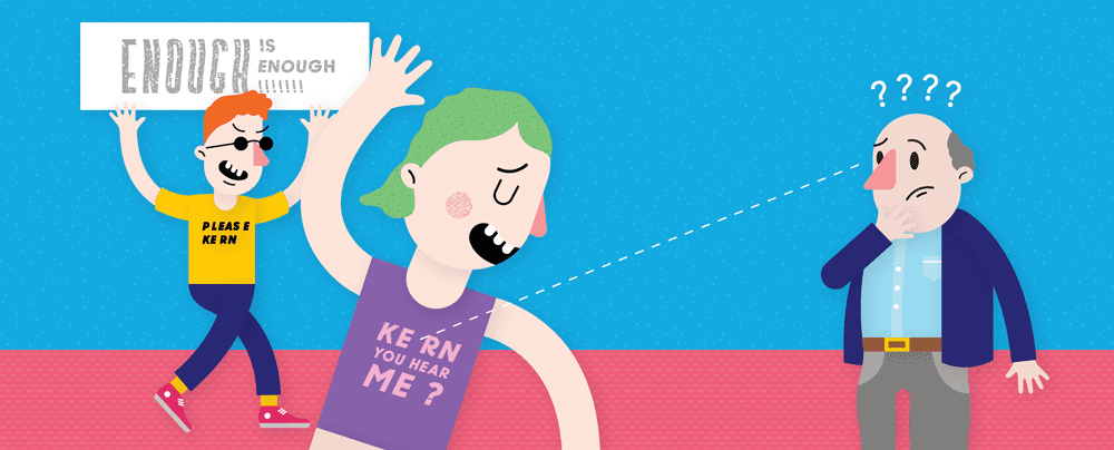
We can’t say it enough – kerning! No, it has nothing to do with popcorn – kerning is the spacing between two individual characters or letterforms, or the typography, in other words. If the spacing looks unnatural, why not touch it up a little? Do this especially if you’re trying to make a BOLD statement, unless you’re ok with people staring uncomfortably at your custom printed tshirt fixated on the incalculable gap between the E and the R. #Awkward…
Here’s a fun game you can play online to brush up on your kerning skills!
6. V is for Vector
For anyone specifically wanting to screen print, Photoshop rasters just won’t do…unless Snoop Lion is a vector artwork! Vectors and raw EPS files are what you want to use to create for a clean, crisp screen print image. For best results, grab your pen and type tool, and make sure to outline your fonts! Also, ensure that you export your work, logo, sports team number/s etc. as a high quality .png.
7. Think Contrast!
This rule is more about having some common sense in how your design is viewed. If you want your design to stand out, don’t go printing black on a navy blue t-shirt, unless you’re after a super super super subtle effect.

8. Quality Matters
As with all printing, the quality of print depends on the surface of the print area. A hot tip from us – if you want a consistent and smooth print outcome with your garments, choose a smooth fabric. The best brand of shirts I’d recommend for a high quality print outcome, especially for photographic imagery, would be printing with AS Colour, Bandsome and Hanes garments.
9. You Wouldn’t Steal A Car…
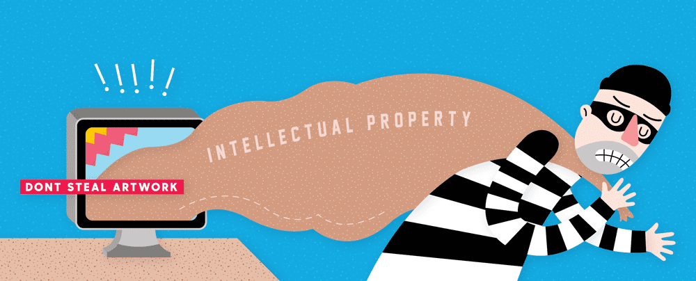
Ok, ok – lame reference, but I had to say it anyway. Stealing or plagiraising artwork is a massive no-no! Intellectual property always reigns supreme, and using another company or artist’s work without their permission can be super costly for you. Apart from the legal aspects of printing artwork that isn’t yours, we know you can do better!
Let your creative juices flow and get designing; or, if you don’t have access to creating original artwork, contact The Print Bar! We’re always happy to help create original artwork with you.
10. Pretty in Primary
While we can get pretty close with matching and printing bright colours on our digital printers, like all digital print methods across the board there are some colour limitations. Things like neons, metallics and some pastels are unable to be printed using direct to garment printers, unlike with silk screen printing.
We suggest sticking with your RGB palette, using cyans and magentas (for example) as primary colours for digital printing, and letting your colour dreams run wild when you’re preparing for a screen print order, because with screen printing we can Pantone colour match, baby!
In Summary…
Did we miss anything?
Have a question for us, or need help with a design?


